

One of the first things most people do when launching a new blog is install a plugin to help readers share their content. Maybe you’ve done the same, dreaming of retweets, trending threads and a wave of inbound traffic from social media.
Then reality hits. The post goes live. You refresh Google Analytics, and… nothing.
The truth is most blog posts get little to no social traction. Not because the content isn’t good, but because the sharing experience isn’t thoughtfully designed.
Virality isn’t luck. It’s architecture.
This post is a deep dive into how to build that architecture and how to make your share buttons actionable, how to use UX and behavioral psychology to boost sharing and how to ensure you’re not just relying on outdated plugins or invisible icons.
Let’s rethink how you approach social sharing from the ground up.
Why Most Share Buttons Fail
You’ve seen them: the same row of tiny social icons tucked at the bottom of a post, usually gray or muted, rarely clicked. They’ve become internet wallpaper.
The UX Problem
Small, passive share icons tucked beneath the comment section or mashed into a floating sidebar don’t convert. Most users won’t even notice them, and the few who do won’t feel compelled to interact.
If a button doesn’t look tappable or purposeful, it might as well not exist.
We’ve learned from years of conversion rate optimization that placement and intent matter more than presence alone. Social sharing is no different.
Make Sharing Intentional and Actionable
The difference between “a button” and “an action” comes down to context and clarity.
Helpful Tip
Buttons placed at emotional or informational peaks perform better than those placed blindly at the start or end.Think mid-article prompts next to bold claims or relatable stories.
Don’t Just Add Buttons. Create Sharing Opportunities
This means aligning buttons with:
- Emotional reactions: awe, curiosity, anger, joy
- Social value: information that makes someone look smart or helpful
- Calls to belong: something your reader wants others to know they’re part of
For example, after a surprising stat, you could add a line like:
“Know someone who’d be shocked by this? Share it.”
You’re not just enabling a click, you’re giving them a reason to do it.
The Psychology Behind Why We Share
Understanding why people share is more important than just knowing how. Behavioral psychology gives us a useful framework for engineering more shareable content.
1. Social Currency
People share things that make them look good. It could be insightful, hilarious, cutting-edge or inspirational but it always reflects back on them.
Use this principle in your CTAs:
- “Be the first to share this”
- “Impress your team with this insight”
- “Tweet this tip to look like a genius”
Helpful Tip
Frame sharing as a way for users to build their personal brand or social status.“Help your followers stay ahead of the curve.”
2. Triggers and Timing
People are more likely to share if something reminds them to. That’s why content tied to recurring events, like weekly roundups, end-of-year trends or Monday motivation, tends to spread.
3. Emotion
High-arousal emotions (awe, excitement, anger, fear) increase sharing. Your content doesn’t need to be outrageous, but it should make people feel something and then give them an outlet.
If your post sparks empathy, provide a “Share this story” button. If it inspires action, encourage users to “Tell your network.”
Good Share Button Design
It’s not enough to have buttons, they need to work.
Best Practices
- Make them big enough to tap. Use at least 44px x 44px targets, especially for mobile.
- Label them clearly. Don’t just show icons. Add “Share on Twitter,” “Post to LinkedIn,” etc.
- Limit choices. More than 3–4 share options creates friction and lowers action.
- Use contrast. Buttons should stand out visually without clashing with your design.
Use Recognizable Buttons
Whenever possible, use official buttons or well-designed equivalents. These come with platform trust signals (colors, icons, logos) and often better metadata support.
Avoid the default “AddThis” style clusters unless you customize them to fit your brand and audience.
Choosing the Right Platforms
Don’t guess where your audience shares, check your data.
Head into Google Analytics 4 or your social referral reports and look at:
- Top social referrers
- Most shared content
- Which posts drive traffic from each network
From there, prioritize buttons for:
- Twitter/X
- WhatsApp or Email (if you have a more personal or professional audience)
Helpful Tip
Check your GA4 traffic sources to prioritize the 2–3 social platforms that are actually driving traffic.Focus beats coverage every time.
Use Tools That Let You Customize
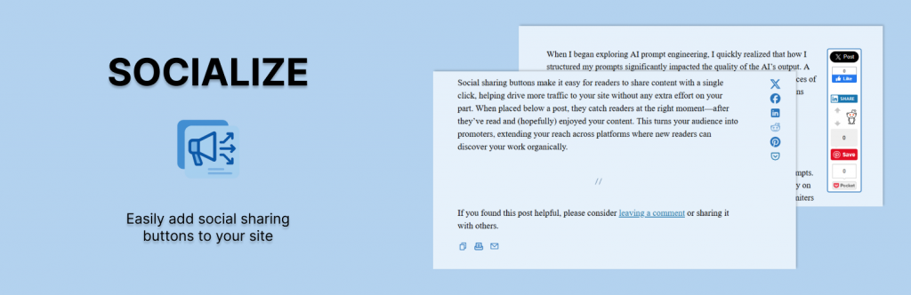
Why I Built the Socialize Plugin
Most social sharing plugins are either bloated or inflexible. I built Socialize to offer a simple, lightweight solution that gives you control over:
- Which networks to include
- Where buttons appear (floating side, above, below or both)
- How they’re styled
It’s designed for WordPress creators who want a fast-loading site and buttons that fit their brand.
If you want a no-frills plugin that just works and doesn’t track your users or load 300kb of unnecessary scripts, Socialize is worth checking out.
Technical Must-Haves
Before you go live with any sharing setup, make sure you have these covered:
Open Graph and Twitter Card Metadata
When someone shares your content, platforms like LinkedIn or X pull the preview from your metadata. Make sure it includes:
- A strong image (1200×630 recommended)
- An accurate, click-worthy headline
- A short, compelling description
- Canonical URL
Use metatags.io to preview your metadata, or run tests using:
Share Link Tracking
Use UTM parameters in your share URLs to track where your shares are coming from:
https://yourdomain.com/blog-post-title?utm_source=twitter&utm_medium=social&utm_campaign=organic_shares
This helps you track not just who shared, but who clicked.
Evergreen Shareability Tactics
If you want to future-proof your posts for viral potential, bake shareability into your content process:
1. Include Highly Sharable Elements
- Stats
- Controversial takes
- Personal stories
- Visual infographics
Each of these can be turned into a compelling share moment.
2. Use Strong Visual Hierarchy
Design your blog layout so share buttons are clearly visible without overwhelming the reader. Think:
- Floating buttons on mobile
- Mid-article CTAs
- Post-summary prompt
3. Encourage Specific Sharing Behavior
Generic “Share this post” CTAs don’t work. Try:
- “Tweet this insight”
- “Send this to your manager”
- “Bookmark for later, or share with your team”
Final Thoughts
There’s no single button or plugin that will make your content go viral. But thoughtful UX, strong visual design and a bit of psychology go a long way.
So ask yourself:
- Are my share buttons visible and intentional?
- Am I giving users a reason to share?
- Does my content trigger emotions worth passing along?
If not, now’s the time to rework that sharing experience. And if you’re on WordPress, try Socialize for a more elegant way to get your content moving.
Helpful Tip
Think of social sharing as a conversion funnel. Optimize it like you would any other conversion goal.It’s not about adding buttons, it’s about guiding behavior.
4 replies on “Increase Viral Potential With Actionable Bookmarking and Sharing Buttons”
[…] a previous post I talked about how to increase the viral potential of your content with more actionable bookmarking and sharing but…. Now here is a list of cool custom bookmarking and sharing buttons you can use on your blog that […]
I agree, but for Twitter users (where the majority of my traffic is coming from at the moment) I prefer to create Retweet Links rather than buttons, because (a) a link gives more more control over the wording, allowing for more creativity, and (b) some of the Twitter plug-ins ask for my password (nope!) or plug themselves (i.e. “via @tweetmeme”).
Also, don’t forget (for new blogs especially) the negative social proof that no Diggs or tweets on the plug-in counters presents.
I just wrote a retweet link tutorial on my blog – I found that Twitter users clicked on the links more than the “tweet me” plug-in buttons.
[…] Blogging, Social Media In a previous post I talked about how to increase the viral potential of your content with more actionable bookmarking and sharing but…. Now here is a list of cool custom bookmarking and sharing buttons you can use on your blog that […]
[…] Blogging, Social Media In a previous post I talked about how to increase the viral potential of your content with more actionable bookmarking and sharing but…. Now here is a list of cool custom bookmarking and sharing buttons you can use on your blog that […]